Being close friends with the groom's sisters,
I was more than happy to get involved in this newest project.
I've known Thi for the longest time, and he's like a little brother to me,
and I thought his sisters rubbed off the whole
"no one's good enough for my little brother" mode on me,
but when he said he was marrying Michelle,
that's when I realized that as long as he was with the right one,
none of us had to have a stinkin' attitude.
. . . . . . . . . . . . . . . . . . . . . . . . . . . . . . . . . . . . . . . . . . . . . . . . . .
INVITATIONS
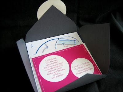
the bride found this invitation style online, loved the geometric look,
but wasn't too thrilled about the layout they offered.
i designed the layout with the intention of getting them printed through that vendor.
we did not realize that we were not allowed to customize the layout
until she went to order them, so instead of going with a layout
the bride wasn't entirely happy with, i elected to make everything on my own.
the outer pocket, invitation, reception card, response card, name label,
map & directions were all made by hand (printed elsewhere).
of course, hand-made items are not the same as machine made ones,
but it gives some character, and hey, i did save them about $500!
CEREMONY PROGRAMS
i love the colors the bride picked for her wedding.
the bold colors of royal blue & hot pink accented with gray
truly went well the geometric shapes of circle & square.
for their ceremony program, i stuck with the circular mode of the invitation,
and i must admit, it was a lot of work trying to cut out all those circles,
but as long as the end result is great, all the hard work pays off.
RECEPTION PROGRAM & MENU
ESCORT CARDS
More related to this wedding...

rehearsal dinner menu.
in all the frenzy of trying to get everything done in time,
these almost didn't make it to the dinner...
because i forgot to send these to them along with others.
thank God for overnight shipping.
of course, hand-made items are not the same as machine made ones,
but it gives some character, and hey, i did save them about $500!
CEREMONY PROGRAMS
i love the colors the bride picked for her wedding.
the bold colors of royal blue & hot pink accented with gray
truly went well the geometric shapes of circle & square.
for their ceremony program, i stuck with the circular mode of the invitation,
and i must admit, it was a lot of work trying to cut out all those circles,
but as long as the end result is great, all the hard work pays off.
RECEPTION PROGRAM & MENU
along with the dinner menu so i consolidated
the two items to avoid having two separate items on the table.
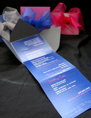
the program / menu is made with the same pocket design as the invitation,
and i purposefully went with the wide ribbons to create large bows
as these were a part of the table setting.
ESCORT CARDS
sticking with the geometric shapes,
i decided to make a prism with equal dimensions to create a square face
and use a circle to print guest names.
side view
a little hole was punched on the back of the prism
to show the guest's table number.
More related to this wedding...

rehearsal dinner menu.
in all the frenzy of trying to get everything done in time,
these almost didn't make it to the dinner...
because i forgot to send these to them along with others.
thank God for overnight shipping.


No comments:
Post a Comment