Monday, July 18, 2011

Labels: YoBelle Frozen Yogurt


These labels were designed for a self-serve frozen yogurt chain located in Napa, CA. 


This business had been opened for a while 
when I took over some of the design duties, 
and the owner was not satisfied with their existing designs. 
The flavor labels in particular did not match the concept of the store, 
being too dark and old-fashioned. 
I went with more of a fluffy and bubbly design, 
and instead of using photos of each flavor, I decided to illustrate them. 
I will tell you it took a lot longer to go that route, 
but I must admit, I am much satisfied with the end product. 
Oh, yeah, and my client was very much pleased with them, too. 


fonts used 
Niagara Engraved, Existence Light


fonts used 
Amerika, Existence Light


fonts used 
Porky's, Existence Light


fonts used 
Caffe Latte, Existence Light


fonts used 
HandelGotDBol, Existence Light


fonts used 
Gismonda, Existence Light


fonts used 
Atman Bold, Existence Light


fonts used 
French Script MT, Existence Light


fonts used 
Festival Nights JL, Existence Light


fonts used 
Kristen ITC, Existence Light


fonts used 
Hobo BT, Existence Light


fonts used 
MandarinD, Existence Light


fonts used 
Bodoni BdCn BT, Existence Light


fonts used 
AmericanUncD, Existence Light


fonts used 
MD Gaesungche, Existence Light


fonts used 
Matisse ITC, Existence Light


fonts used 
Niagara Solid, Existence Light


fonts used 
Aquaduct Warp, Existence Light


fonts used 
Haettenschweiler, Existence Light


fonts used 
GoudySans BlkIt BT, Existence Light


fonts used 
Gigi, Existence Light


fonts used 
OzHandicraft BT, Existence Light


fonts used 
Quixley LET, Existence Light


fonts used 
Orange LET, Existence Light


fonts used 
PenStitching, Existence Light


fonts used 
Myriad Web, Existence Light


fonts used 
Pump Demi Bold LET, Existence Light


fonts used 
Freehand575 BT, Existence Light


fonts used 
Girls are Weird, Existence Light


fonts used 
Frosty, Existence Light


fonts used 
Glamourgirl, Existence Light


fonts used 
GlooGun, Existence Light


fonts used 
Souvenir Lt BT, Existence Light


Birthday Card: 55 Candles


A personal touch is always appreciated! 

My mom's little brother, uncle SH, is still a kid at heart at 55. 
The age difference between the two is over a decade, 
which explains why he is the way he is. 
Not saying he is immature or irresponsible, 
just emphasizing he knows how to "relate" to us "youngsters". 
He's still the playful uncle I remember from when I was a little girl. 
Can't believe the man is now 55, a good-looking 55-year-old, 
and here's to hoping his candles burn brighter than ever. 

. . . . . . . . . . . . . . . . . . . . . . . . . . . . . . . . . . . . . . . . . . . . . . . . . . 


five tall candles to indicate each decade 
and five shorter ones to indicate each year


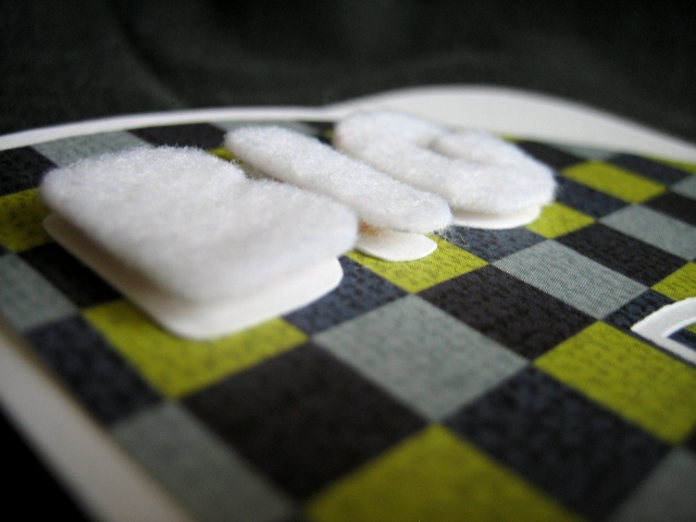
close-up to show depth of the candles.  
i used up all the leftover scraps of papers from other projects. 
never let anything go to waste!


YOO original hopes your wishes come true!


Tuesday, July 5, 2011

Birthday Card: Cheers to My Not Just a Drinking Buddy


A personal touch is always appreciated! 

Hannah and I call each other "drinking buddies" 
because we both enjoy chatting and catching up and chilling out over a drink or two.  
We used to be "beer buddies", but now we've expanded our horizon. ^^ 
Years ago, it used to be that it was only she and I who enjoyed our drinks. 
Alcohol may have been the link that brought us together, 
but she is more than just a drinking buddy to me now. 

. . . . . . . . . . . . . . . . . . . . . . . . . . . . . . . . . . . . . . . . . . . . . . . . . . 


HANNAH
her name was a lot of fun for me to play around with. 
the "A"s in her name were turned upside down to be made into martini glasses.


close-up to show depth of the name "hannah", 
and to show the different materials used for the card. 


to a friend who is more than a drinking buddy... 
CHEERS! to you being present in my life. 
God bless! 
did some word playing... "cheers", "present"


two orange slices made up the "O"s in YOO original


Tuesday, June 28, 2011

Birthday Card: Big D's BirthDay


A personal touch is always appreciated! 

For the man who calls himself "Big D", David. 
He may be tall, but not exactly the imposing in stature.
None of us friends are sure how that name suits him, 
but we still call him that just to satisfy him.  
He's got such good friends!

. . . . . . . . . . . . . . . . . . . . . . . . . . . . . . . . . . . . . . . . . . . . . . . . . . 


big D
naturally, big D is what i went with for david's birthday card.  
no other creative idea needed there. 


showing depth of the word "big"


negative space of the D was cutout


happy birthDay big D! 
used cut out of the D on the inside of the card


YOO original smiling a D shaped smile 


Sunday, June 26, 2011

Birthday Card: a Lot to Celebrate


A personal touch is always appreciated! 

Uncle ST & family have gone through a rough year, 
with our aunt going through chemo and trying to survive ovarian cancer. 
After several months of ups and downs, 
auntie is cancer-free, and even though she's still weak, 
the whole family is putting the whole ordeal behind them! 
Praise God!

. . . . . . . . . . . . . . . . . . . . . . . . . . . . . . . . . . . . . . . . . . . . . . . . . . 


happy birthday 
banners are always a centerpiece to different types of celebrations


close-up so show depth. 
it's a 2-layered banner.


YOO original is holding up a banner!